Creating 'Wistman Oak'
Publication date: 20 September 2021
This is a description of the process involved to produce one of my recent prints, 'Wistman Oak'


This is a description of the process involved to produce one of my recent prints, 'Wistman Oak'
This is the story of the creation of my print 'Wistman's Oak. This print has been jury-selected for exhibition at the Wells Art Contemporary (September 2021) and the Woolwich Contemporary Print Fair (November 2021).
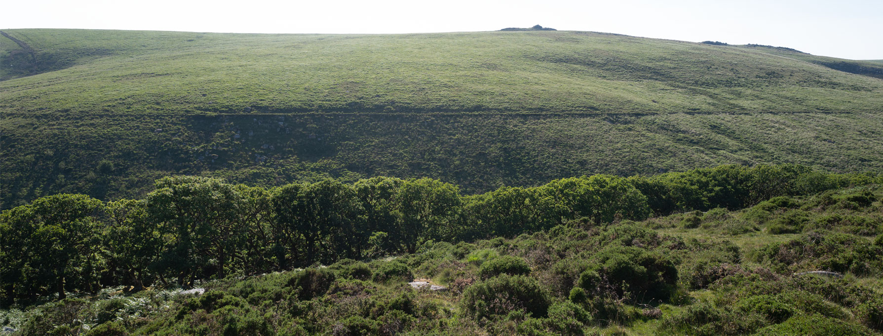
Over the years, Wistman's Wood (pictured above) has become a bit of an obsession for me - it's one of those rare, magical, places which feel disconnected with the 'normal' world, where the possibility of the unexpected hides amongst the boulders and the roots of the trees.
From the outside, the wood might be described as nondescript. It is located along one side of a river valley on otherwise open moorland close to the centre of Dartmoor - a collection of undergrown oaks that seem to be trying hard not to draw attention to themselves.
But inside, the wood tells a very different story, especially on a misty spring morning, or when the summer sun is filtering through the canopy and throwing shadows across the moss-covered boulders through which the dwarf-oaks push themselves towards the light.
The trees, some as old as 400 years, are habitats in their own right - with lichens and ferns growing on their trunks and branches.
The wood has many legends attached to it - stories of the Wild Hunt and the Wisht Hounds in particular. But if the place feels haunted, which to me it does, it is in a benign way - although it probably makes sense to pay attention to the old stories that caution against an overnight stay.
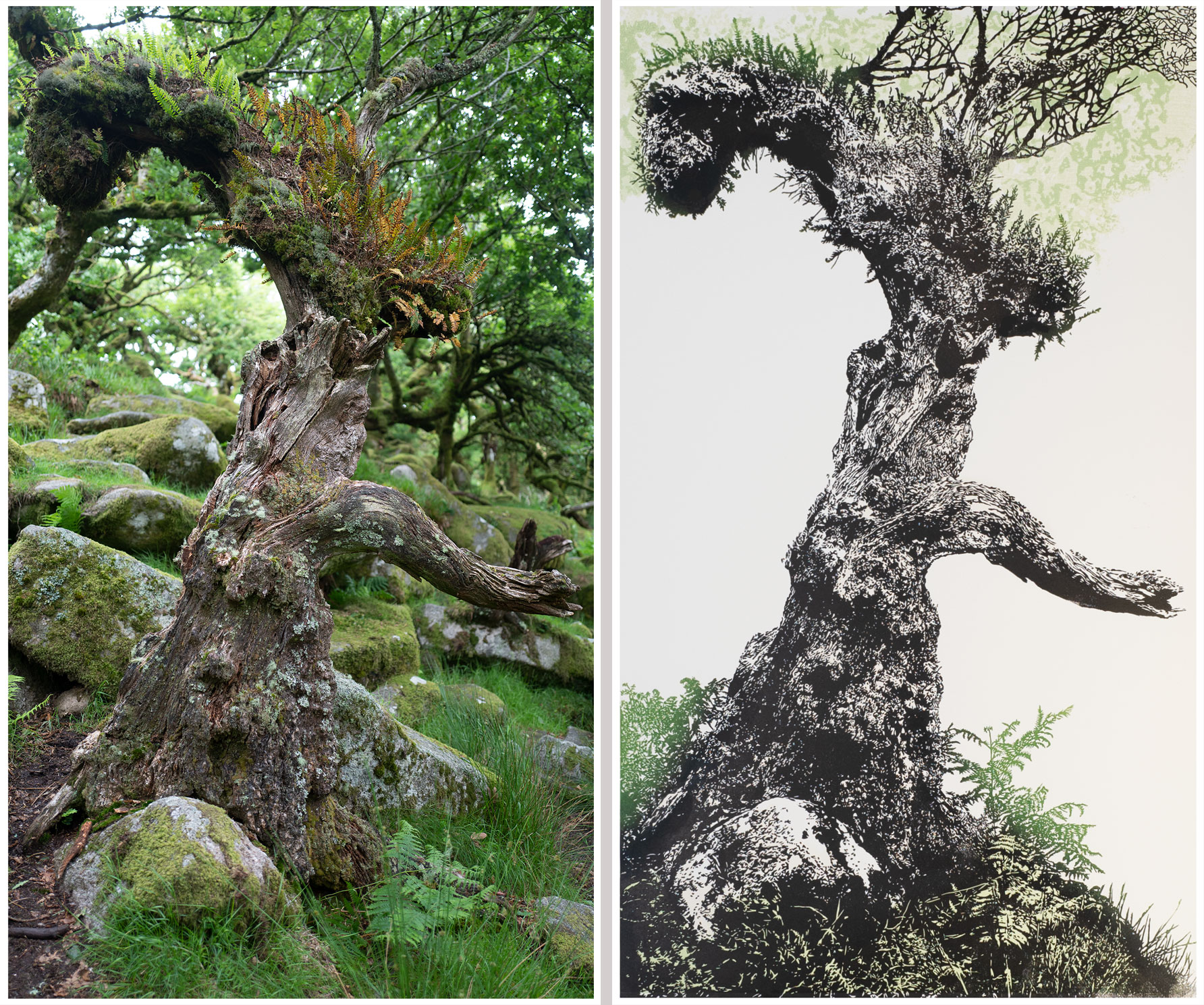
The beginning and the end - my source photo alongside my finished print.
The shape of the tree looks different in these two images, but it isn't - it's the distorting effect of the white space.
The shape of the tree looks different in these two images, but it isn't - it's the distorting effect of the white space.
It took me about 40 hours to get from the original photo to the image I wanted to work with (a section of which is shown above).
I spend a lot of time carefully selecting elements of the original photo to arrive at a black and white version that I transfer onto the surface of the lino by the devious method of gluing a print (produced using a basic Epson printer) of the image onto the lino - by carefully rubbing away the paper I am left with the ink layer which I use as my cutting guide.
For this print, I removed much of the photo background and I added more ferns. For the most part, the white areas of the above image are arrived at by manually erasing all the unrequired photo elements.
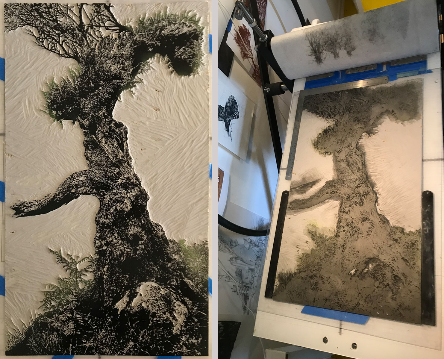
Pictured above is a close-up of the foreground block during the process of cutting.
Pictured above is the lino block for the foreground print layer - this is how it looks when the cutting is finished and all vesitiges of the guide ink have been removed.
Note the crack at the bottom of the lino - caused by me leaning on the lino while cutting... fortunately, the crack line doesn't print!
Note the crack at the bottom of the lino - caused by me leaning on the lino while cutting... fortunately, the crack line doesn't print!
Pictured above is the proofing stage for the foreground block. The greenery for the ferns is inked at the same time as the black - this is tricky and slow to get right but it avoids a lot of hassle with registration!
On the right is the block sitting on my press after printing the proof - the printing ink has been cleaned off the lino.
Note the unintended imprint of my previous project on the blanket...
I've started using the blanket when making these prints - it seems to help keep the paper a little more stable - but I also use three registration tabs along the leading edge - each tab has two points of attachment. These tabs are really good - they don't wear out with use, and the metal base parts are quite large - which keeps them stable and makes it easy to fix them to the perspex that I attach the lino to (note - I don't attach the lino directly to the printer bed, and I don't fix the perspex to the bed either - which means the perspex/lino is able to move a little as it goes under the roller.
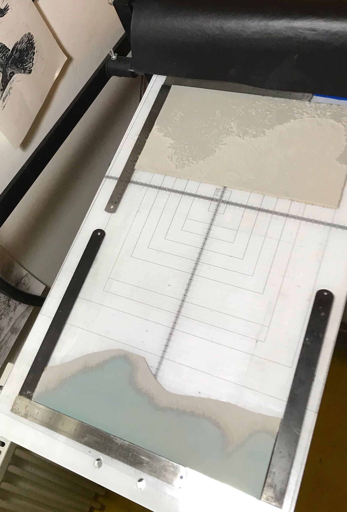
Pictured above - two of the three blocks i used for the background colours. This is the press set-up for the first background print run.
The steel rulers are handy for lining things up and for keeping the block in position (although, for registration, I print the proof image of the foreground block onto tracing paper, which is tabbed in the same way as the paper I'm going to print on - that way, I can use the tracing paper print to manage registration during the later stages of the project).
The steel rulers are handy for lining things up and for keeping the block in position (although, for registration, I print the proof image of the foreground block onto tracing paper, which is tabbed in the same way as the paper I'm going to print on - that way, I can use the tracing paper print to manage registration during the later stages of the project).
The image above is the second background print run. For this, I reduction-cut the lino I used for the first run in order to overprint with the darker green.
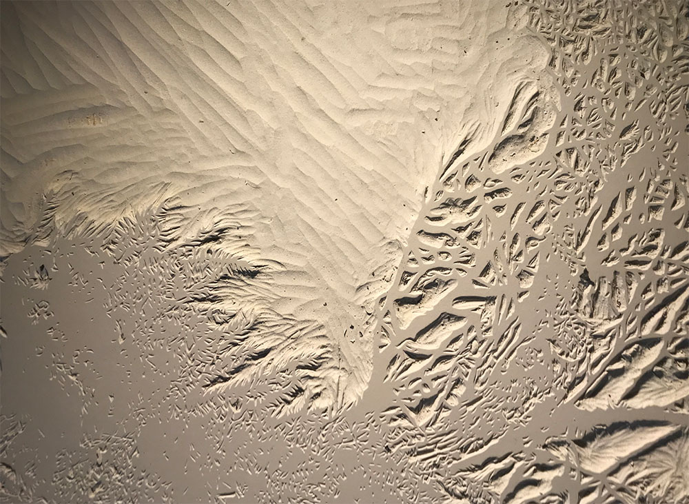
During both the first and second print run, I covered this block with muslin in order to achieve a more textured printed surface - the press squeezes ink through the muslin onto the paper, leaving the textured effect which is shown in the resultant image on the right.
During both the first and second print run, I covered this block with muslin in order to achieve a more textured printed surface - the press squeezes ink through the muslin onto the paper, leaving the textured effect which is shown in the resultant image on the right.
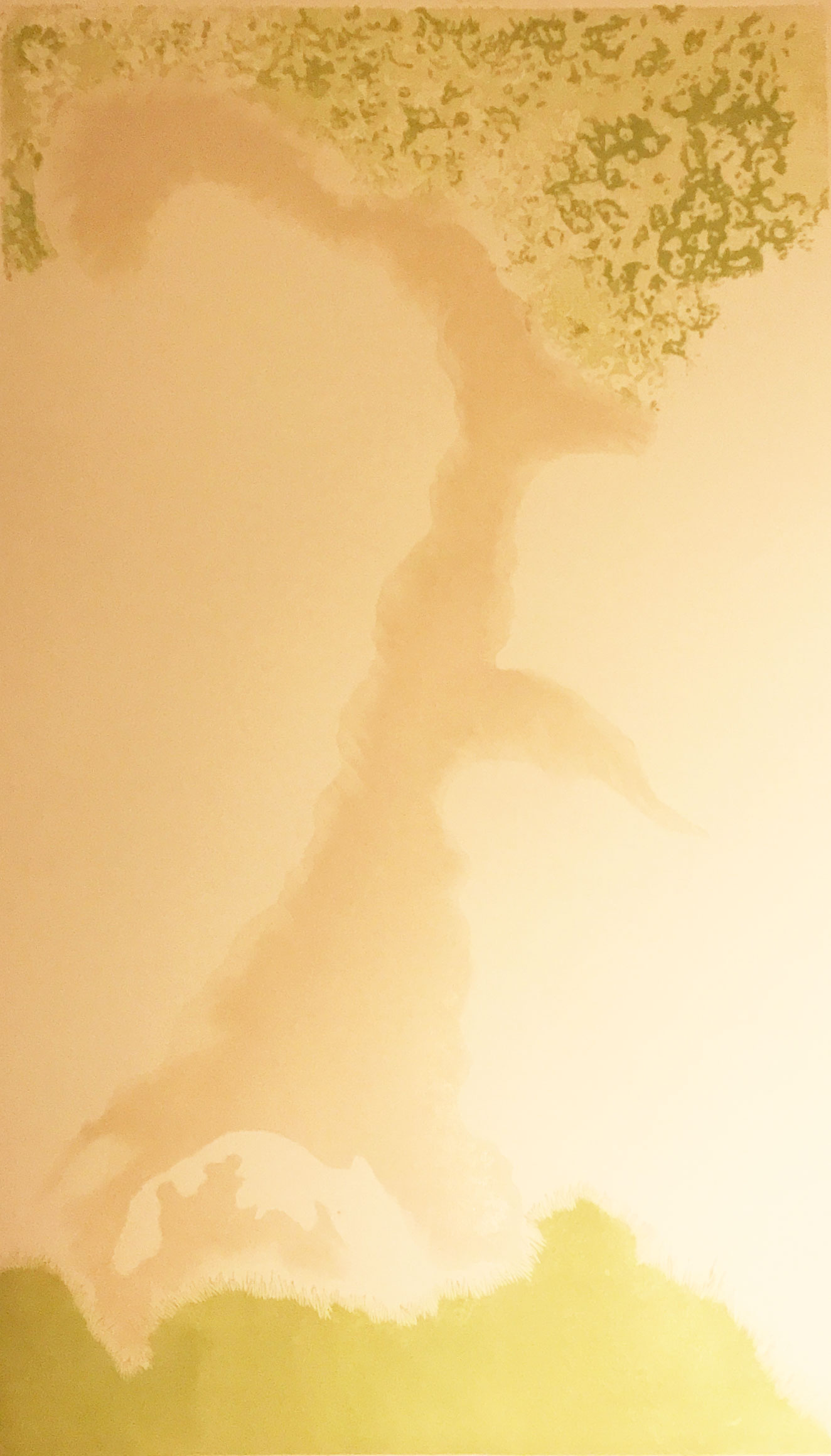
This is not a great photo - in real life the paper is a lot less yellow... but it shows the finished background printing. The grey area was intended to provide shaded sections for the tree... unfortunately, I used too light a colour, so on the final print it's barely visible... which is ok, the print still works... but I could have save myself a good eight hours work there!
Also, note the edges of the grey, and the cut edge of the green at the bottom - both techniques were used to avoid the background ink leaving an unwelcome and visible edge below the final black layer.
Also, note the edges of the grey, and the cut edge of the green at the bottom - both techniques were used to avoid the background ink leaving an unwelcome and visible edge below the final black layer.
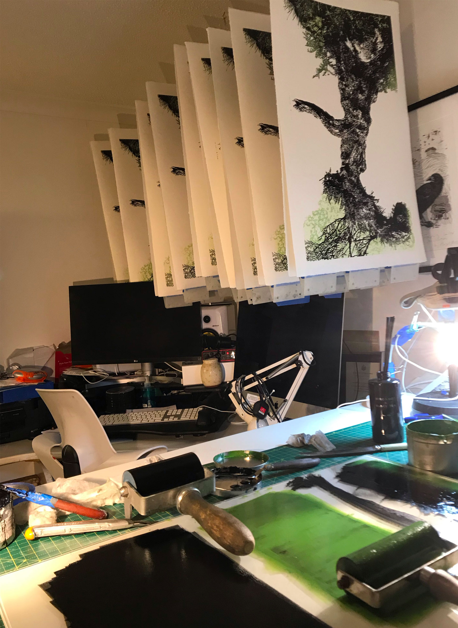
Pictured above - the final print run! Here is the first batch of prints hung up to dry, and my inks on the table. I work in a mess... what can I say?
I timed the production of this final print stage at between 10 and 15 minutes per print... which is a lot of time when you're printing 30 in one go...
There were failures - but these were mostly due to me forgetting to clean the block of ink that had been rolled onto non-image parts of the lino before pulling the print... I probably did that about 8 times during the run... yep... 8 times... put it down to tiredness...
Here's a larger version of the final image. For some reason, my camera refuses to capture the actual colour of the paper, which is very light cream, rather than the grey that appears here. So, in real life, the print looks even better than it does here...
I'm very happy with the way this project has turned out and, despite the mistakes I made, the run produced a reasonable-sized edition - around 22, i think... I haven't checked yet as the prints are still drying on the line!
The introduction of a lot of white space is new for me - it's an approach I'll be exploring more in future - and this is only the third time I've used the muslin texture technique. This is also the largest possible print I can produce on my Gunnings No.2 press... I'm saving up for a No.3...
If you would like to, you can buy a copy of this print by clicking here!
Connect


My newsletter: